Yet Another Useless Chart
The prevalence of terribly designed charts and graphs is astounding. When attending conferences, I am always surprised by how many excellent researchers have no clue (or maybe don’t care) about how to communicate their data or results effectively. It seems like an important skill, no?
I’m especially sensitive to the over-use of the (completely useless) pie chart. The other day I stumbled upon this article on marketing analytics on Forbes.com. The article included the following chart:
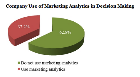 Image: Source: Forbes.com
There are several problems with this chart:
-
Low information density
Charts are a great tool for communicating both data, and relationships between data, more efficiently and effectively than by merely using sentences (or tables). But in this case, only two numbers are being communicated, and they are written down on the chart and surrounded by a bunch of junk (colors, a pie). All of the ink dedicated to this junk results in incredibly low information density, an indication of bad chart design.[^1] [^1]: Tufte’s fantastic book The Visual Display of Quantitative Information defines and discusses information density, as well as other principles for designing good information graphics. The pie chart design violates pretty much all of these principles.
-
Distorted data
The only thing more useless than a pie chart is a 3D pie chart.
The perspective in this chart distorts the areas in the slices, which is hilarious since the slices are meant to represent the magnitide of the data values. Namely, the green section in the front of the chart is by far the largest, yet it represents the same about of percentage as the area in the back. This makes it difficult for a human to visually estimate and compare the volumes of the various slices (hence the values have to be written out explicitly!).
-
Misleading information
The presence of the two numbers in the pie chart, 37.2 and 62.8, give the impression that the values represented are exact (i.e. exactly 37.2 percent of companies use marketing analytics). Yet they are just estimates! As the text explains, 37.2% is an average, and has a (fairly large) 95% confidence interval of (31.5%, 43%).
So this chart actually diminishes understanding of the data. Pretty egregious!
One possible solution?
I always say that programming should be taught to all high school students, giving it status equal to math or history. Perhaps information graphic design should be required for college students!